I had planned on writing on MACRA and the inability of those who criticize the law to offer up alternatives to fix the flaws. I got tired of the conclusions from the skeptics: let providers be and they will do the right thing. That is a recipe for the pendulum to swing too far in one direction. The “right thing” will wind up costing the Treasury a ton of dough. History has already born that out.
I am one of the skeptics as well, though. I had no idea how CMS was planning to stitch this whole thing together–and I was waiting for hints from Andy Slavitt, top dog at CMS, based on his testimony last week on the Hill. Well, if you shorted Kleenex stock, pat yourself on the back. You can put your hankies away because it looks like CMS may postpone the start date. My screed lives for another day.
That gives me an opportunity to highlight some excellent charts from MedPAC (they just released their 2016 Data Pack). If you are not familiar with MedPAC, they are a chartered, independent committee that produces unbiased reports for Congress. The commissioners and their staff responsible for assembling the data focus on Medicare primarily but, a) because Medicare is immense, and b) the trends within Medicare often parallel the health system writ large, inferences readers draw have universal application. I should also add their reports are outstanding. They write in a clear voice and their figures always connect the dots. Incidentally, I find their material better than mainstream journals on policy and clinical trends and what they produce will resonate with novices and experts alike (thus, Congress as an audience–not always the most learned in the ways of healthcare).
I plucked some choice charts on trends that bear watching. It won’t take long to figure out the theme. A clue:
–2016: Go to your local hospital and get your hip replaced; we can check up on that sore throat and lower back of yours as well.
–2026: Go to your local hospital to get that throat and back examined; let’s check up on that sore hip while you are here.
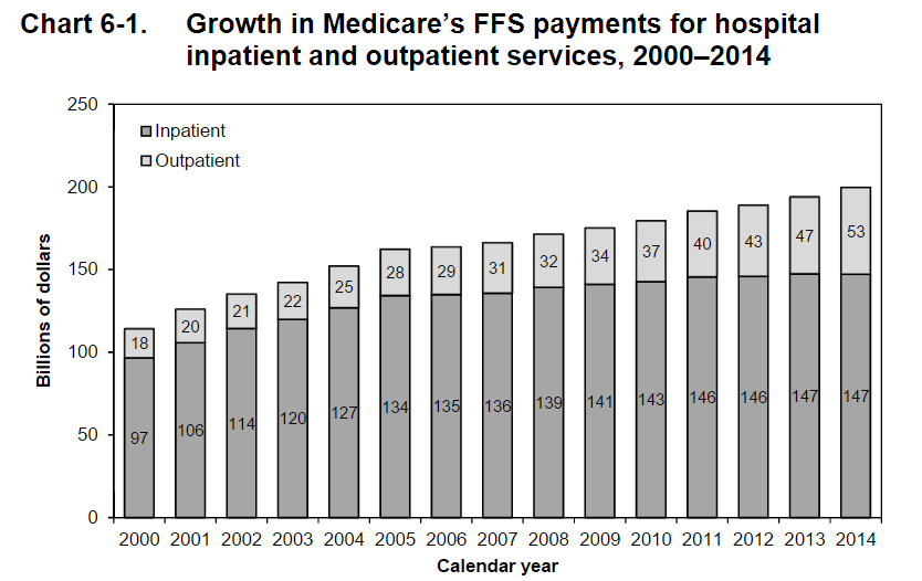
Notice something in 6-1? In 2000, hospital outpatient spending was 14%. In 2016, it is now 26%. Remember when hospitals lived for their operating rooms? Now it’s acquiring docs, practices, and building ambulatory space.
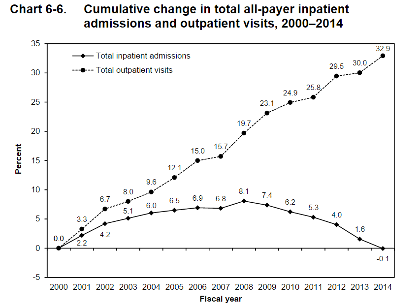
Notice something in 6-6? It is that downsloping line. Hmmm. Which one is upsloping? That place you get your throat checked, I think.
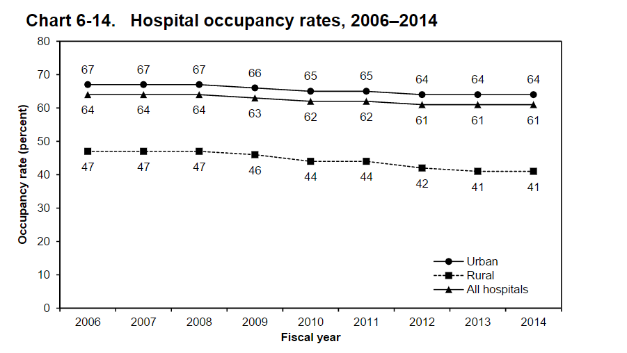
Notice something in 6-14? It looks like those beds are filling up, huh? Imagine. Rural hospitals with an occupancy of 41%?
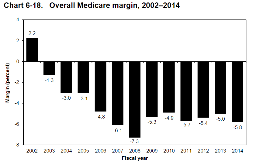
You will note in 6-18 that CMS is missing the mark. For every $100 your hospital spends, they are only getting back $94 from Uncle Sam. What skinflints! But here is an alternative explanation: hospital operating costs may be too high. Some hospitals have more than their share of well-appointed lobbies, beautifully tiled bathrooms, and oversized California rolls on their menus. Yes, I am overstating things, but the medical industrial complex has something to do with how we got here. In 2014, 25% of hospitals had overall Medicare margins of 5.9% or higher, and another 25% had margins of –15.6% or lower. About 39% of hospitals had positive overall Medicare margins in 2013. You need to ask why some hospitals can make it on Medicare rates and others cannot.
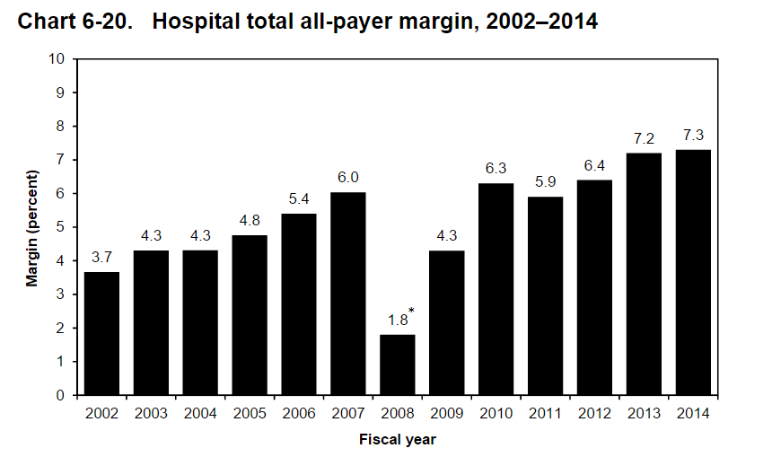
But alas, in 6-20 you will observe the empire strikes back. How does a hospital lose money on Medicare patients but have a positive margin–a high of 7.3% in 2014? They get it from private payers and MCOs. However, if you are following the news, that gravy train is slowing down. Those margins will not hold indefinitely in most institutions. Barring unrestrained market power (“must have hospitals”) which is a growing problem to monitor by the way, the edge hospitals maintain will attenuate.
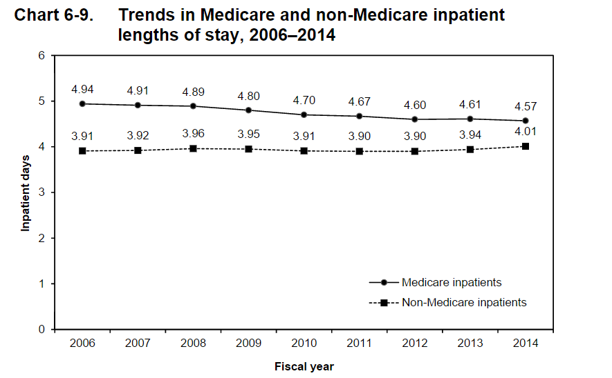
But in 6-9 have a look at LOS trends in Medicare and non-Medicare patients. In 2014, the average length of inpatient stays for Medicare beneficiaries was approximately one-half a day longer than for non-Medicare inpatients. In 2006, the difference was more than a whole day. You can see that as a glass as half empty or full: were Medicare patients staying too long or are commercial patients not getting the heave-ho for reasons associated with figure 6-20 above?
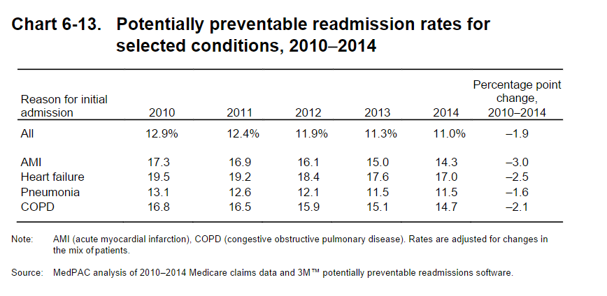
Lastly, 6-13 gives the lowdown on readmits. Most of you are familiar with the numbers, but it’s always nice to see them in aggregate. Again, you will note fewer return trips to the hospital.
I selected only a fraction of the data pack figures to make a point (there are tons more). Hospitals will morph. Not because they want to but because they have to. Medicare works off of administered prices, i.e., fixed from CMS and non-negotiable. Therefore, the only options hospitals have is to bargain with private payers. But private payers are getting hip–and so are patients. MCOs are beginning to haggle harder, and part of that haggle means more clarity in costs and a migration of care to the community, where things are cheaper to deliver.
We cannot envision our hospitals as anything but places to tend to tumors, prosthetic joints, and acute abdomens. But like Amazon, GE, IBM, 3M, and others–behemoths transform. I always say, “the beast that writes our paychecks is the very beast we have been set upon to slay.” Many of us have not realized that yet, and data points like those above will keep on coming. Pricey, inpatient health services will not be an unlimited jobs program nor a compact with the community to perpetuate unrealistic hospital cost growth. Innovation and fancy gadgets are nice, but at some point, we will cry uncle.
We are living the change right now. You will convey to the next generation of trainees, “I remember when the hospital use to have…,” with a wistful smile. And you will sound as old as those who you mocked with gray hair and black leather doctor bags when you first embarked on training.
Yes, I remember when I only bought books on Amazon. Silly me. That was not that long ago.


Leave A Comment